

📝Design Tricks: Give any poster a professional look with the right use of color and typography! The key to making a simple design look attractive and professional lies in the use of the right colors and typography. Many people think that the more colors and complex fonts they use, the better the design will be—but the real secret is simplicity, consistency, and the right balance!
In this special episode of Digital Knowledge Hub, we will learn- Correct color scheme (Color Palette):
Creating the right color scheme or color palette in design is an art. The right palette not only makes the design look attractive, but also helps to highlight the brand identity and keep the viewer’s attention in the right place.
Let’s take a look at the main types of color palettes and how to create a perfect color combination in a professional way.
1. There are basically 5 types of popular palettes created using the color wheel:
| Category | How is it made? | Field of use | Examples |
| Monochromatic | Using different shades (dark) and tints (light) of any one color. | Minimalist, simple and premium design. | Dark blue, navy blue and light blue. |
| Analogous | Consists of 3 colors that are right next to each other on the color wheel. | Natural, calm and easy on the eyes visuals. | Yellow, yellow-orange and reddish-orange. |
| Complementary | Two colors that are directly opposite each other on the color wheel. | Create high-contrast and highlight buttons/calls-to-action. | Blue and orange, or purple and yellow. |
| Triadic | 3 colors equidistant on the color wheel (like a triangle). | Vibrant, colorful, and playful design. | Red, yellow and blue. |
| Split-Complementary | One main color + 2 colors on either side of its opposite color. | To create balance without providing a sharp contrast like complementary. | Blue, red-orange and yellow-orange. |
2. Steps to Create the Perfect Color Palette:
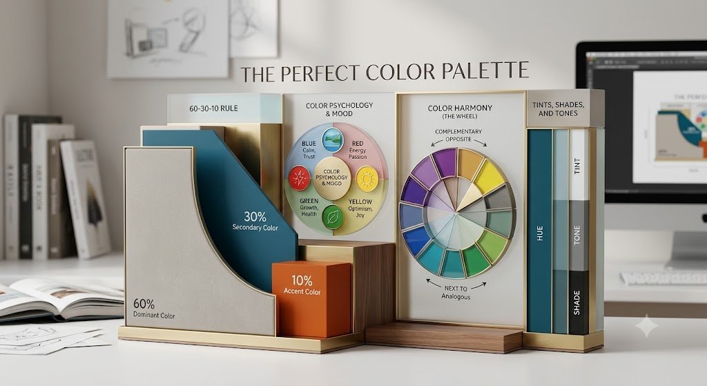
Follow these rules to create the right layout for a project or brand:
Choose a primary color for your brand:
What is the brand’s core message? (Example: blue for trust, green for freshness). This will be your main color.
Add accent and neutral colors:
Choose 1–2 supporting colors in addition to your main color.
Add neutral colors like white, off-white, gray, or black for your background and text.
Apply the 60-30-10 rule:
60%: Neutral background.
30%: Main brand color (cards, headings, sections).
10%: Accent color (buttons, highlights, calls-to-action).
3. Popular free tools for creating color palettes
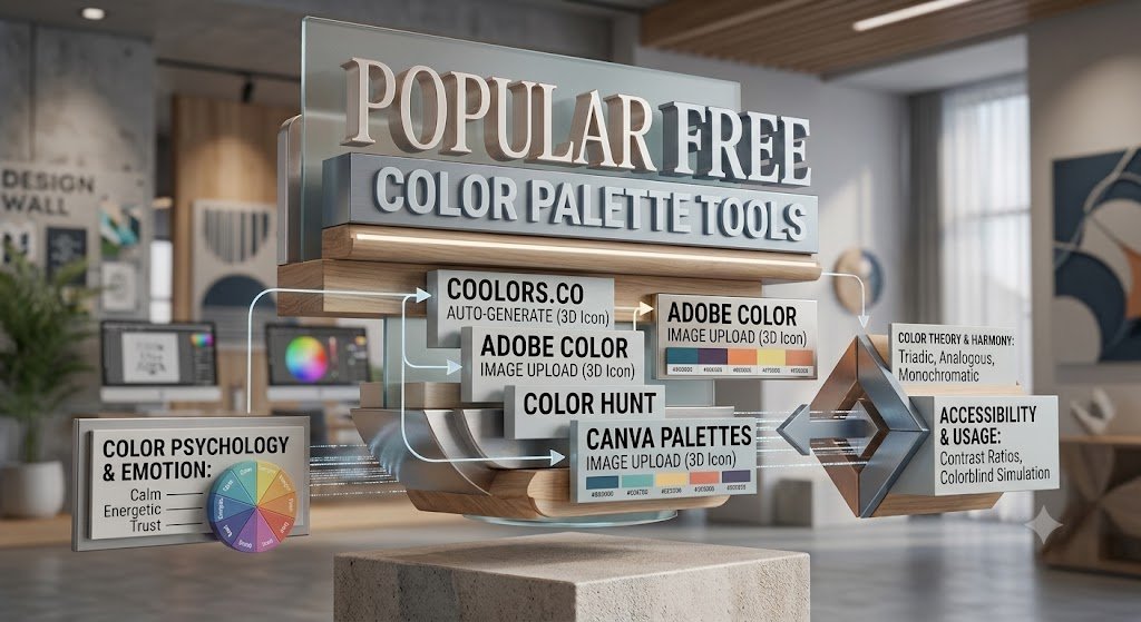
If you have trouble matching colors manually, you can use these great tools:
Coolors.co: Easily generate thousands of trending color palettes by pressing the spacebar.
Adobe Color: Great for creating your own palettes using the color wheel (analogous, complementary).
Color Hunt: A huge freemium library of trending color palettes created by top designers.
Happy Hues: A great guide to seeing how colors will look in real website designs.
Designer Tips: Always use Color Contrast Checker to check the contrast between text and background after finalizing colors.
Let’s now learn the basic rules for the correct and professional use of fonts in design:

Text in design not only conveys the message, but also sets the mood of the design. Even a great design can lose its appeal if you don’t use the right font.
1. Types and uses of main fonts:
To choose the right font for your design, you first need to understand their types:
| Font type | Characteristics | Suitable places for use | Examples |
| Serif | The edges of the letters have small curves or extra marks. Gives a classic and authentic feel. | Print media, books, magazines, newspapers and elegant branding. | Times New Roman, Georgia, Orion (Bengali) |
| Sans-Serif | The edges are perfectly straight and clean. Modern, simple and minimalist. | Website, mobile app, presentation and digital banner. | Arial, Roboto, Inter, Hind Siliguri (Bengali) |
| Display / Script | Handwritten or artistic style. Quite stylish but a little difficult to read. | Logo, poster heading, invitation card or brand title. | Pacifico, Lobster, Charyapad (Bengali) |
2. Golden rules for font use
(a) Maintain typographic hierarchy
So that the reader can understand at a glance which is the main heading and which is the body text, it is important to have a visual hierarchy:
H1 (Main Heading): Largest and boldest size.
H2 (Sub-heading): Medium size (smaller than the main heading).
Body Text: Normal size, which does not strain the eyes while reading.
(b) Keep the number of fonts limited (Font Limit)
Rule: Use a maximum of 2 fonts (3 if absolutely necessary) in a design.
Using additional fonts makes the design look messy and amateurish.
(c) The right strategy for font pairing
When using two different fonts, maintain contrast & harmony between them:
Serif + Sans-Serif: The combination of a Serif heading with a Sans-Serif body text is very popular.
Bold + Regular: Use the bold version of the same font family in headings and the light version in body text.
(d) Line Height and Letter Spacing
Line Height (Leading): The space between two lines. Too little makes it difficult to read, while too much makes the lines look different.
Letter Spacing (Tracking): The distance between letters. In the case of ALL CAPS headings, slightly increasing the letter spacing gives a premium look.
3. Tips for font selection in Bengali design
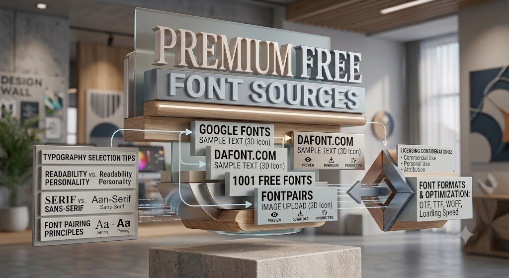
Maintaining readability on screen and in print is challenging in Bengali typography. Some of the best fonts for Bengali design are:
Digital/Web (Sans-serif style): Hind Siliguri, Noto Sans Bengali, Anek Bangla.
Formal/Print (Serif style): Kalpurush, Siyam Rupali.
Heading/Display fonts: Chorui, Mina, Li Ador Noir.
4. Free tools and sources for font selection
Google Fonts: Completely free and the best source for using on websites.
FontPair.co: A great website to see which font will go well with which font.
DaFont / Lipighor: Free font downloads and a huge collection of Bengali free fonts (Lipinor/Lipighor).
Visual Hierarchy: A technique for controlling which text or element the reader’s eye will go to first.
Visual hierarchy is essentially the invisible guidance of design that guides the reader step by step to the right information, rather than randomly wandering around. Its main purpose is: to show important information first and less important information later.
Why is this strategy so important?
- Attention retention: Human attention span is very short. It takes only 2-3 seconds for a reader to decide whether to read a design or not.
- Scannability: Helps the reader understand the main point at a glance without having to read the entire design.
- Encourage specific actions: Call to Action (CTA) buttons like “Buy Now”, “Sign Up” or special discounts on a website or banner make it easier for the reader to make a decision before their eyes.
How does it work in practice? (A real example)
Imagine you are designing an event poster:
Primary Focus: The event’s catchy name or big offer (largest, boldest font).
Secondary Focus: Date, time, and location (medium font, highlighted color).
Tertiary Details: Ticket rules or sponsor logos (smaller font, simple layout).
At a Glance: If the design elements all scream “Look at me first!” the reader won’t pay attention to any of them. Visual hierarchy gives each element its own tone.
What’s in the next episode (Episode 2):
In previous episodes, we’ve covered color placement, font selection, and visual hierarchy in detail. Now it’s time to learn the basic framework for maintaining balance throughout the design.