
Building responsive web applications requires going beyond basic pixel values to design resilient, user-centered digital products. This guide covers practical strategies for selecting breakpoints, structuring fluid UI layouts, and adapting complex components across real-world viewports.
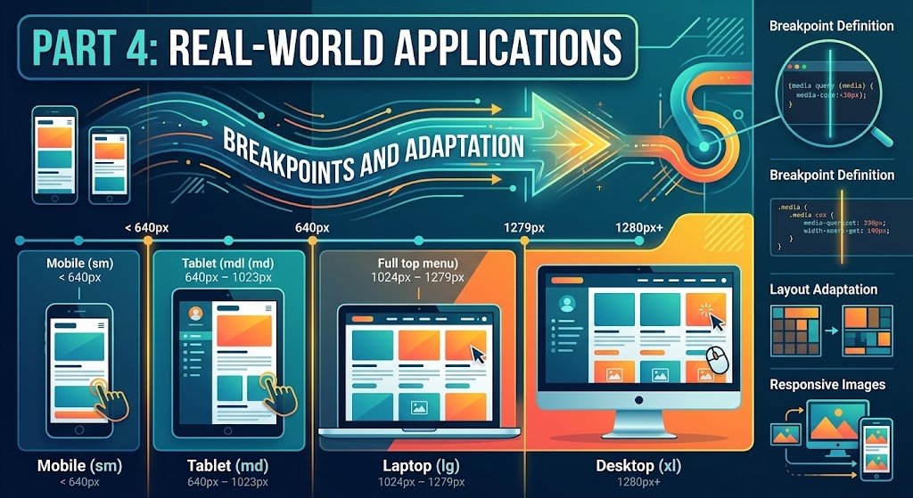
1. Modern Breakpoint Strategy: Content-First vs. Device-First
Rather than targeting specific hardware models (like an iPhone 15 or iPad Air), establish breakpoints based on where your design naturally breaks or becomes difficult to read.
- Mobile-First Base CSS: Write default styles for small screens without media queries to minimize layout engine recalculations on low-powered devices.
- Standard Viewport Tiers: Use standard, widely accepted ranges for major system layout shifts:
| Tier | Range | Common Hardware Target | Key Layout Changes |
Mobile (xs/sm) | < 640px | Phones (Portrait) | Single column, sticky bottom nav, accordions |
Tablet (md) | 640px – 1023px | Tablets, Foldables | 2-column grid, sidebar overlays, expanded header |
Desktop (lg) | 1024px – 1279px | Laptops, Desktops | Multi-column grid, persistent sidebar, hover menus |
Ultra-Wide (xl) | 1280px+ | High-Res Monitors | Fixed max-width canvas container, multi-pane layouts |
2. Modern Adaptation Techniques
Modern CSS minimizes reliance on heavy media query chains by allowing components to adapt natively to their parent containers and viewport dimensions.
Fluid Typography & Dynamic Spacing Replace rigid pixel or rem steps with mathematical dynamic scaling using clamp():
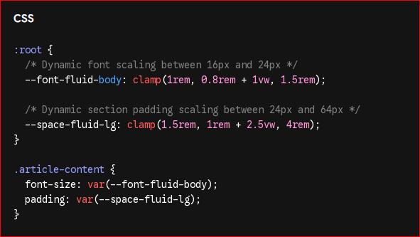
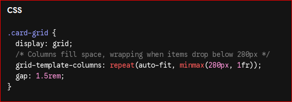
Intrinsic Responsive Layouts with CSS Grid Use auto-fit and minmax() to allow card grids to re-flow automatically without single-point media queries:
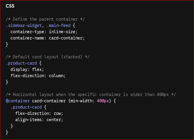
Component-Level Responsiveness with Container Queries Container queries let components adapt based on the size of their parent element rather than the viewport size:
3. Complex UI Component Adaptation Strategies
Different UI elements require tailored adaptation strategies to maintain usability across device sizes:
Navigation Systems
- Mobile: Off-canvas drawer (hamburger menu) or bottom tab bar for thumb-zone access.
- Desktop: Persistent top horizontal header or fixed left sidebar menu.
Data Tables & Complex Lists
- Mobile: Horizontal scroll containers with fixed left columns, or transform row data into vertical card stacks.
- Desktop: Full data table with sticky column headers, sorting, and inline filters.
Form Elements & Actions
- Mobile: Single-column inputs with stacked full-width submit buttons (
width: 100%) for easy tapping. - Desktop: Multi-column form fields (e.g., First Name / Last Name inline) with aligned primary/secondary action buttons.
4. Best Practices & Testing Workflow
- Avoid Device Sniffing: Base layout logic purely on feature capabilities, media queries, and container widths rather than User-Agent strings.
- Manage Dynamic Viewport Units: Use
svh(small viewport height) anddvh(dynamic viewport height) instead of standard100vhto prevent mobile address bars from clipping bottom content. - Test Reality, Not Just Emulators: Verify touch targets (minimum $44 \times 44\text{px}$), actual mobile browser UI chrome overlays, and device orientation changes on physical hardware.
next episod:
Part 5: Performance Optimization & Production Deployment
Transitioning a responsive design from a development environment to a high-speed production site requires optimizing assets, trimming code bloat, and ensuring cross-browser stability.