
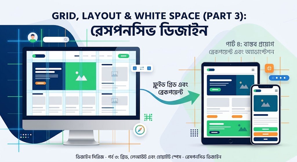
This episode of Digital Knowledge Hub’s Design Series provides a comprehensive look at how to use grids, layouts, and white space to give a simple design a premium and classy look:
1. Grid System: The Invisible Framework of Design
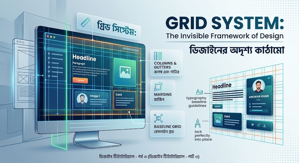
Grids are the foundation of design. Even with the right fonts or colors, a design can look dull if it lacks a grid.
12-Column Grid: This is the golden standard in web and digital design. The number 12 can be easily divided by 2, 3, 4, and 6, so the screen can be divided as desired and content can be placed.
Alignment and Margin: Keeps content in a specific parallel line. Ties all elements together without leaving them scattered left or right.
Visual Balance: This creates visual balance in the design, so that no one side feels too heavy or light.
2. Perfect Layout: Correct arrangement of content
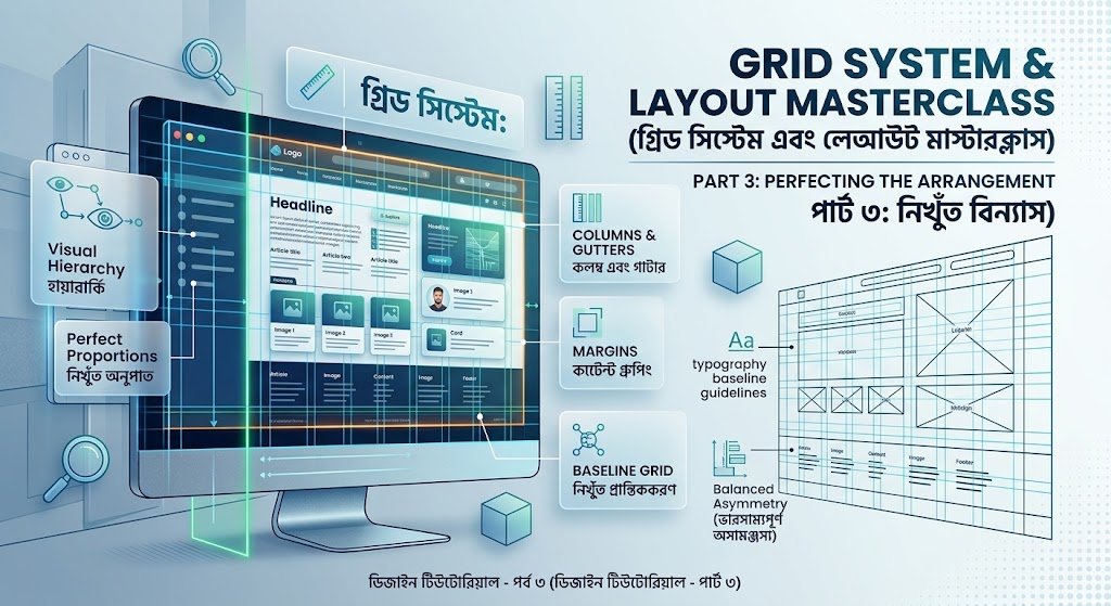
The layout determines the order in which visual elements (text, images, buttons) appear in front of the user.
Visual Hierarchy: Determining where the reader’s eyes will go first. For example: the main heading is the largest, the subheadings below it are slightly smaller, and the descriptions are even smaller.
Eye-tracking Pattern (Z & F Pattern):
F-Pattern: Where there is a lot of text (blogs or articles), people scan from top to bottom, like the English letter ‘F’.
Z-Pattern: On landing pages, people scan from left to right, then down to the left, and finally to the right in a ‘Z’ shape.
Functional Structure: Perfectly arrange the header, hero section, body, and footer.
3. White Space/Negative Space: The Real Key to a Premium Look
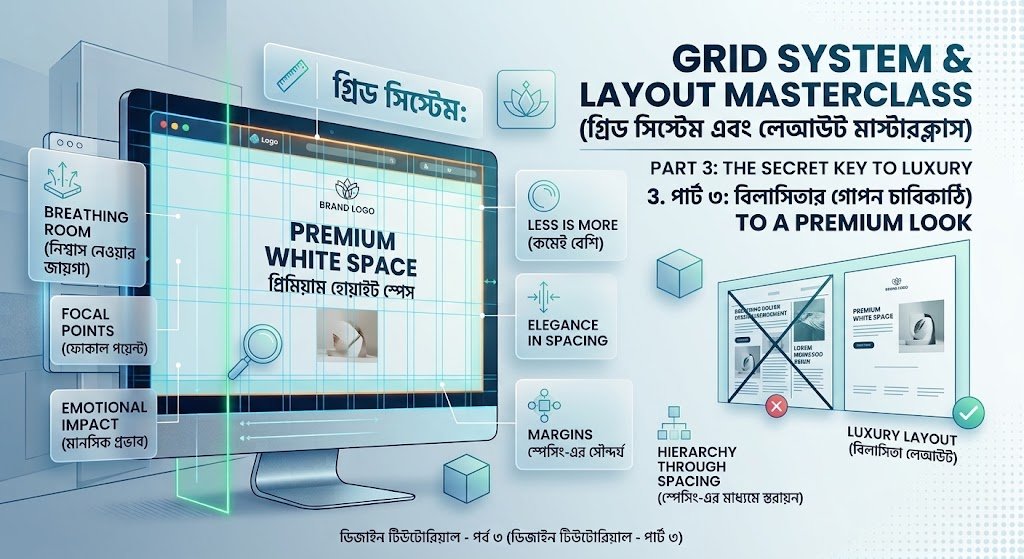
When you look at the designs of premium brands like Apple or Google, one thing becomes clear—a lot of empty space. This is white space.
Give content room to breathe: Without white space around elements, the design looks suffocating and cluttered.
Micro and Macro Space:
Micro Space: The distance between letters (Letter Spacing) and the gap between lines (Line Height).
Macro Space: The large amount of white space between two sections or paragraphs.
Increase Focus: White space essentially draws the user’s eye to the main content or action button.
Application in landing page and card design
| Element | Hero Section Application | Card Component Application | Premium size (Standard) |
| Grid | Split text and images into $6 + 6$ columns | Place 3 cards side by side in 4 columns | 12-column layout |
| Layout | Title $\rightarrow$ Button $\rightarrow$ Image in Z-pattern | From top to bottom: Icon $\rightarrow$ Title $\rightarrow$ Description | Specific visual sequence |
| White Space | Leave large gaps above and below the section | Putting padding between the card border and text | Inner Padding: $24\text{px} – 32\text{px}$ |
If the right colors and fonts are the clothes of a design, then grids, layouts, and white space are the structure and personality of that design. When these are matched correctly, a design goes from ordinary to extraordinary.
Next Episode :
Part 4: Real-world Applications — Breakpoints and Adaptation
In this episode, we’ll look at how to successfully translate theoretical grids and white space to real-life screen sizes. Setting breakpoints and properly adapting layouts for mobile, tablet, and desktop screens will be the main focus of this tutorial.